Natural Capital Exchange (NCX)
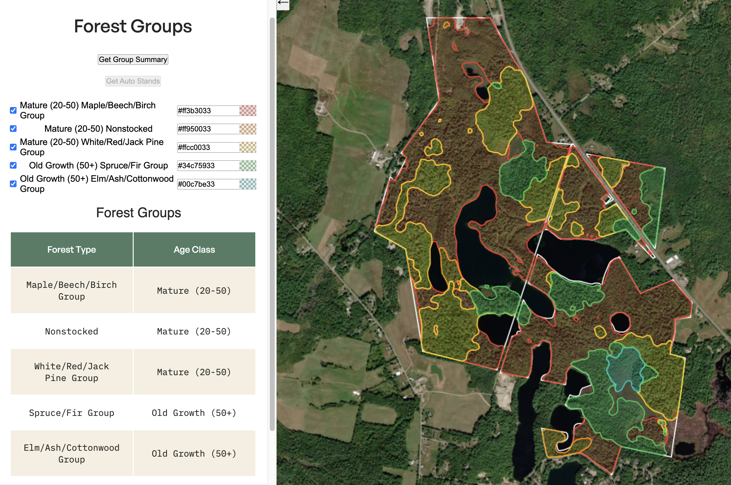
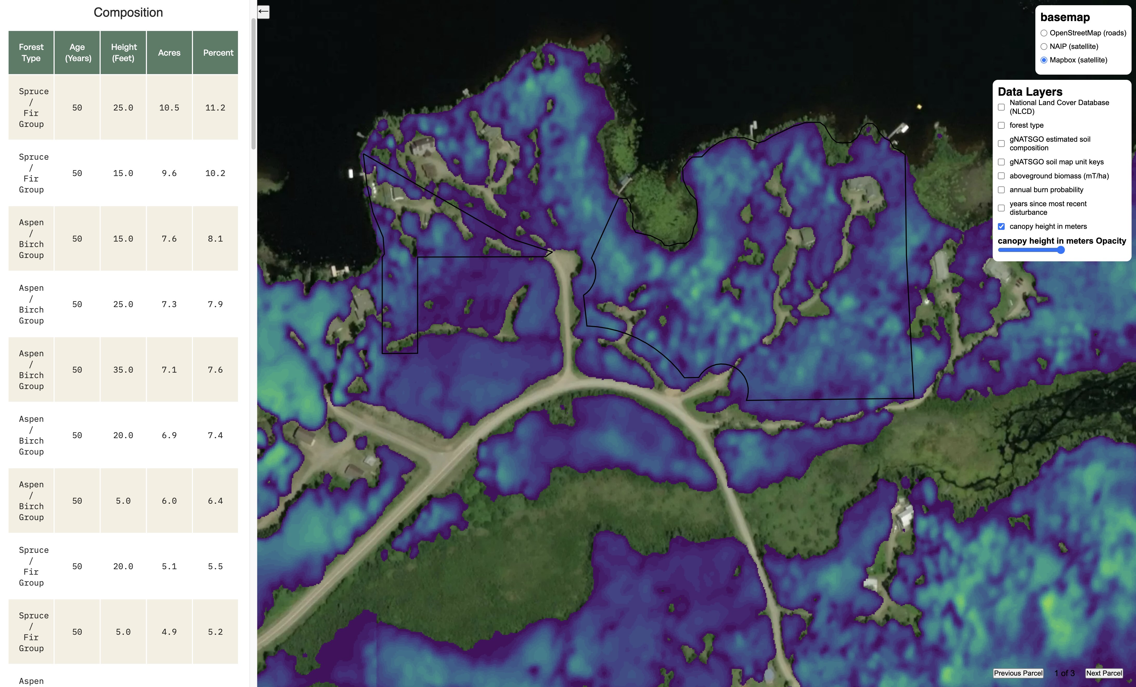
Automated Stand Delineation
Part of our process in making recommendations to landowners involved delineating stand boundaries for their forested land. Typically, this is a fully manual process done by a forestor. I wrote an image processing pipeline that delineated stands using NAIP imagery, canopy height derived from lidar and various raster sources to approximate forest type/species and age of the trees. This rolled out initially as a semi-automated tool for our foresters to use, but eventually I built a fully automated pipeline that could delineate stands in under 10 seconds.
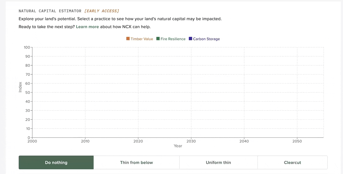
Natural Capital Scores
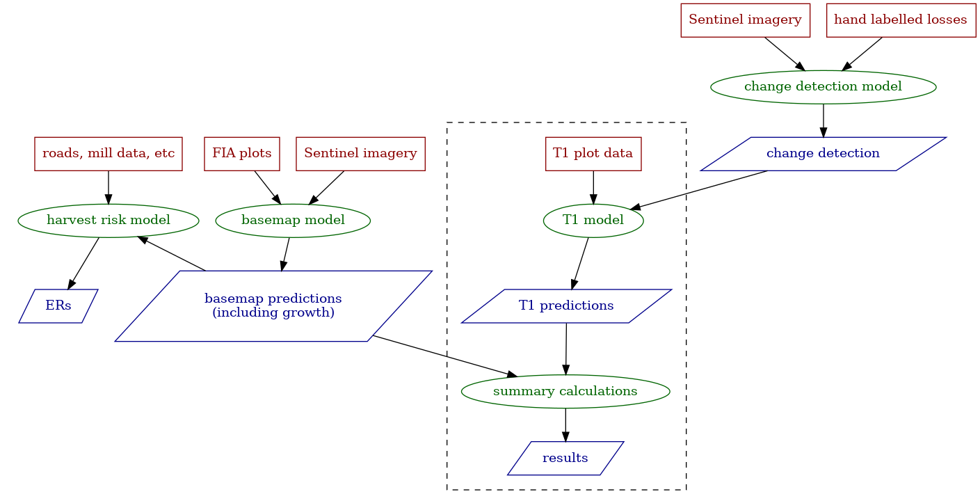
Part of our product strategy at NCX was giving landowners personalized estimates of various natural capital assets on their land. This includes things like timber value, carbon storage potential and forest health. We explored several approaches to creating this data, from an FIA plot state transition model to eventually using the US Forest Service's own Forest Vegetation Simulator (FVS). I created a distributed pipeline using Dask on Coiled to run FVS across tens of thousands of FIA plots in under an hour. The end product is an interactive widget that allows landowners to experiment with different management strategies and see how this affects their natural capital scores.
Land Explorer App
NCX offers a personalized land report called "Natural Capital Advisor" or NCA. The goal of NCA is to provide personalized insights that align a landowner's goals with a feasible managment plan and offer a variety of potential programs to assist funding the implementation of this plan. This is a largely manual process, wherein a trained expert must analyze the property in order to make a recommendation. An earlier product we tested at NCX was a land explorer app, known internally as the "Atlas" App. This application aggregates a variety of sources related to natural resources and earth observation data and makes it available via an interactive front end. This did not resonate with users in initial testing, but I eventually repurposed the Atlas App to assist us internally with assessing a landowner's property for NCA reports. The Atlas App includes everything from Timber volume and price estimates, to in depth soil analysis, localized flora and fauna prevalence.
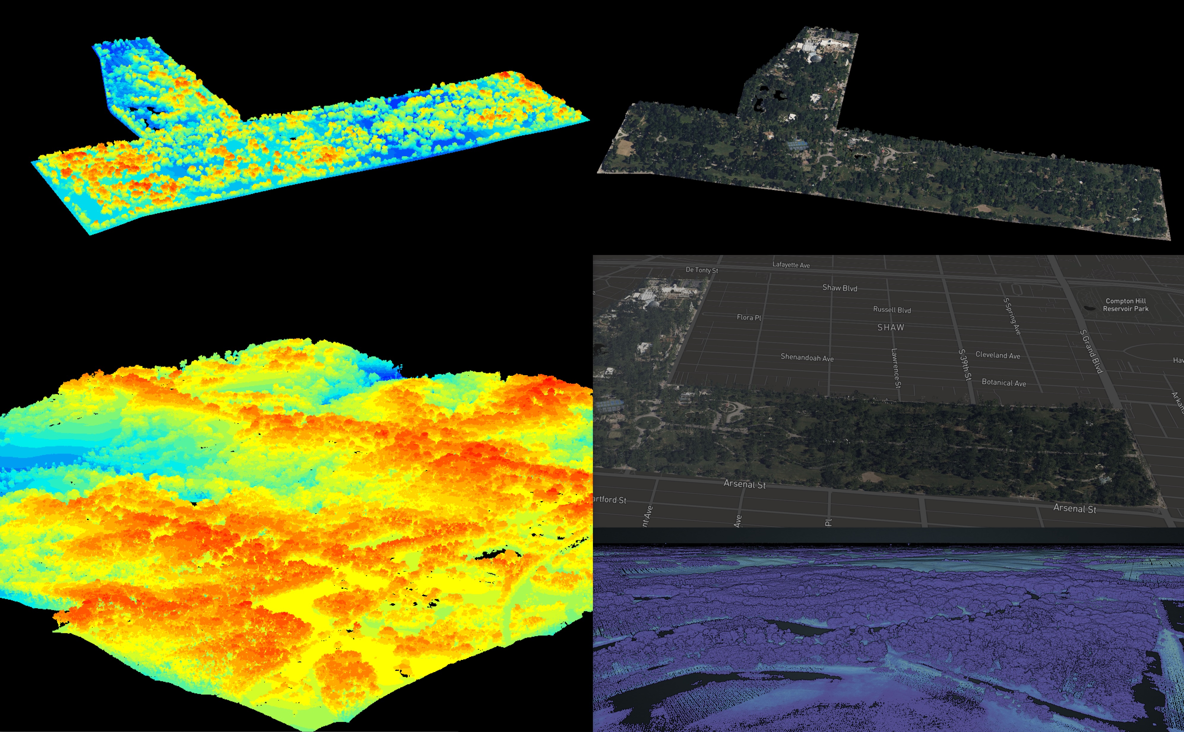
Lidar Point Cloud Maps
One experiment I ran at NCX was generating compelling 3D visuals using openly available Lidar data from USGS. I built a simple pipeline using PDAL to process the Lidar, including colorizing using NAIP or Hexagon aerial imagery. I also experimented with visualizing the point clouds in Deck.gl. Pictured here is a collage of some of the maps I generated, including Tower Grove Park in St. Louis.
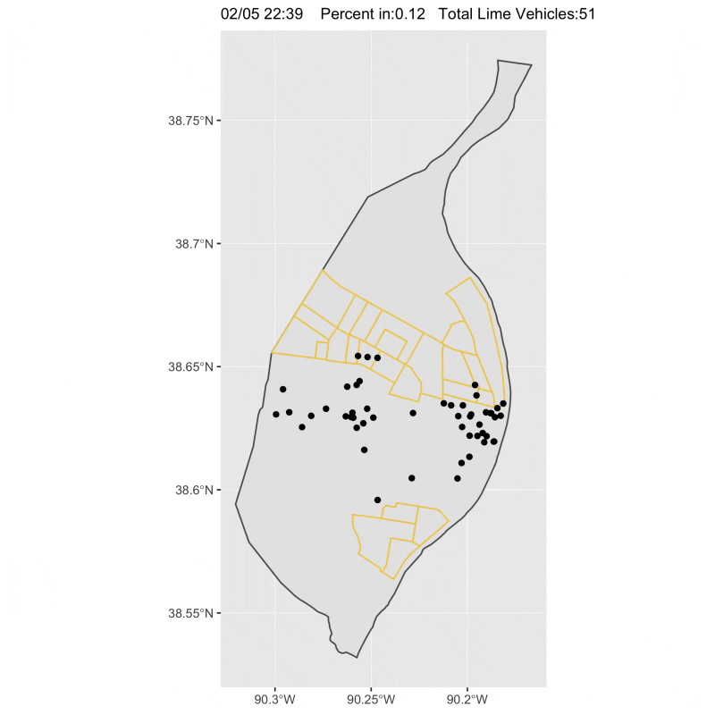
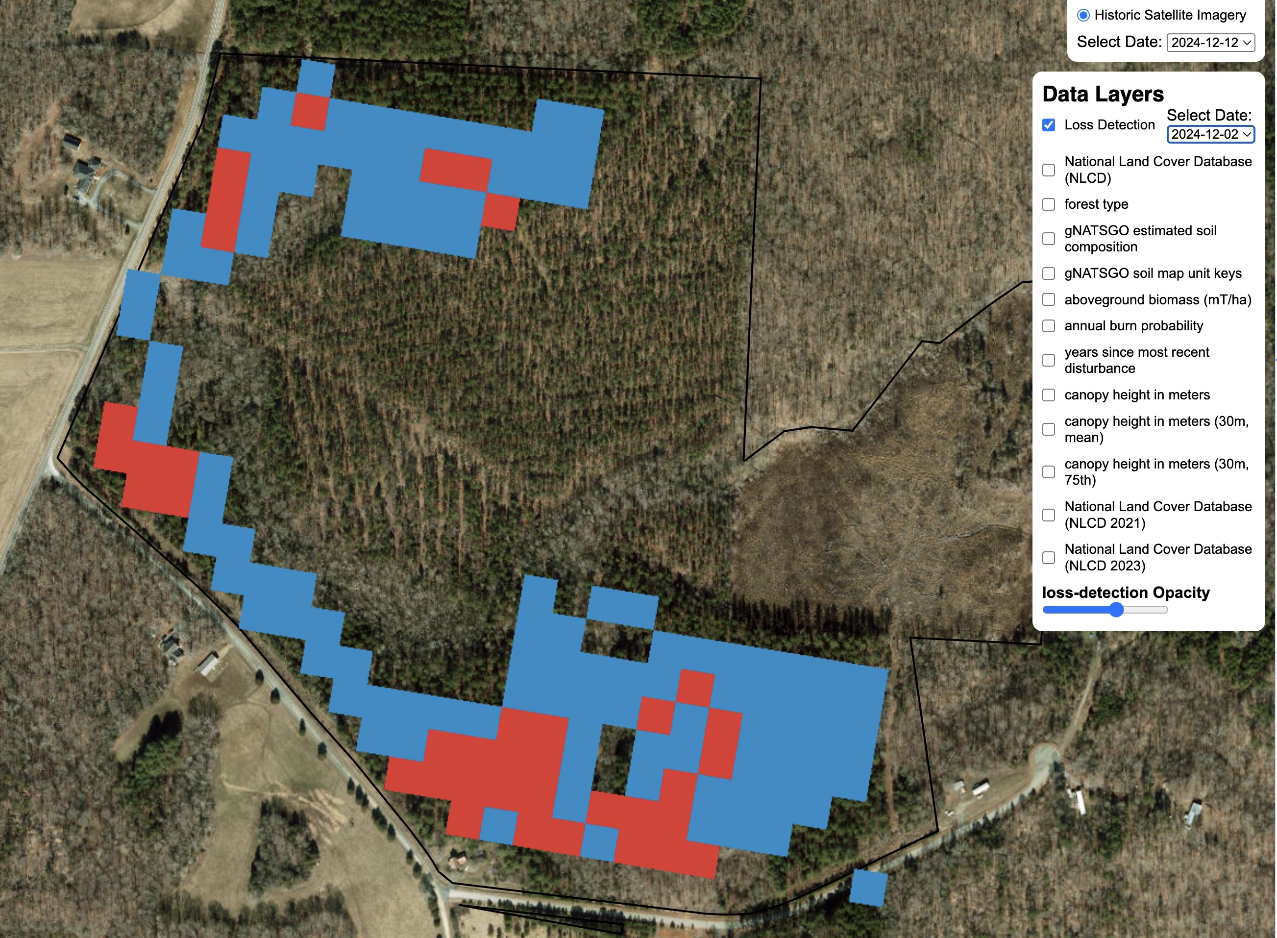
Loss Detection
A critical component of land analysis is loss detection. At NCX, we attempted many varieties of loss detection, from our own in-house method to using the OPERA dataset from NASA.
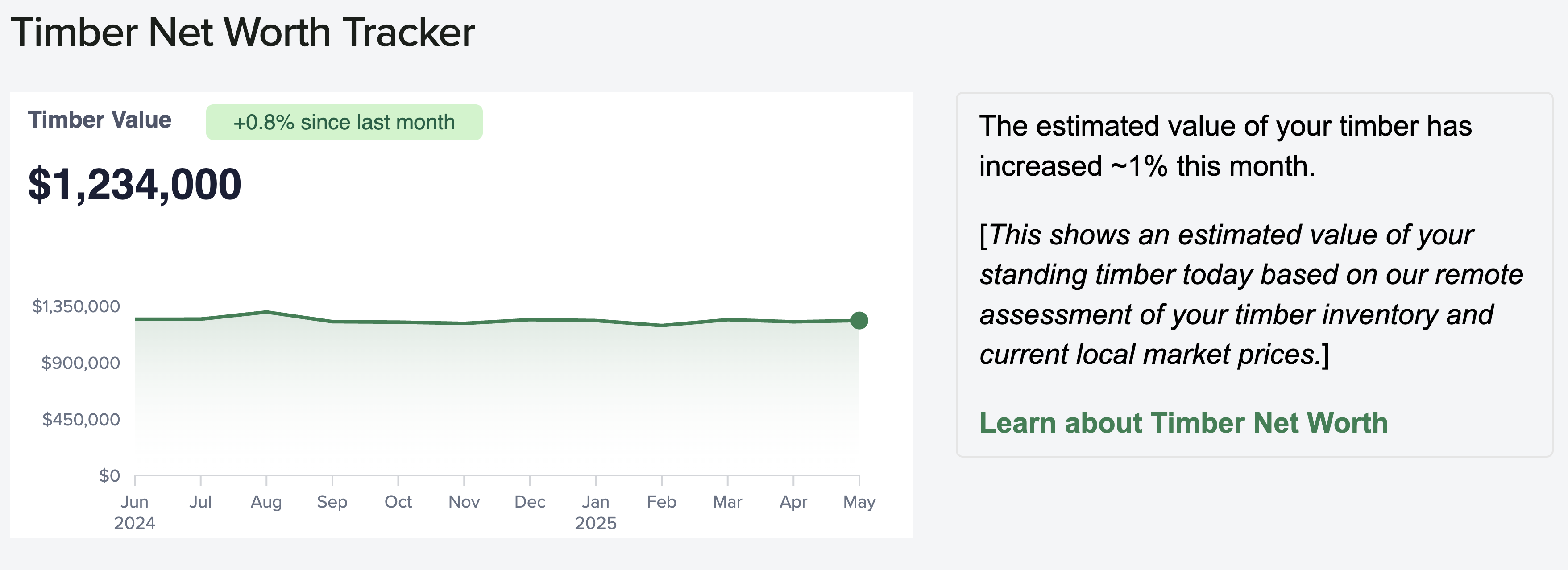
Timber Value Estimates
In valuing natural capital, timber serves as an important baseline for comparison. I built a timber pricing model, scraping numerous data sources for timber prices and combining this with volume estimates to generate accurate estimates of timber value. We eventually sourced a number of proprietary data sources to provide timely information about changes in timber value with the market as well.
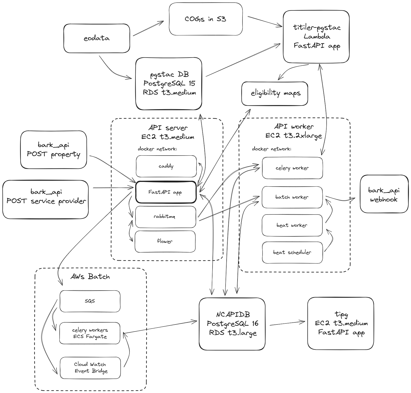
Land Assessment Platform (NCAPI)
With the launch of NCX 2.0, focusing on matching landowners with available opportunities for natural capital developments, we needed to build an entirely new pipeline to stream assessment results to the end-user platform. We built a FastAPI application with a Celery backend, fully integrated with all of the microservices from the eoAPI stack developed by DevSeed. This brought tons of visualization features to the platform as well as intelligent cataloging and management of raster data. I fully migrated and deprecated our Databricks implementation, savings us thousands of dollars per month in compute costs. Developed with Henry Rodman.
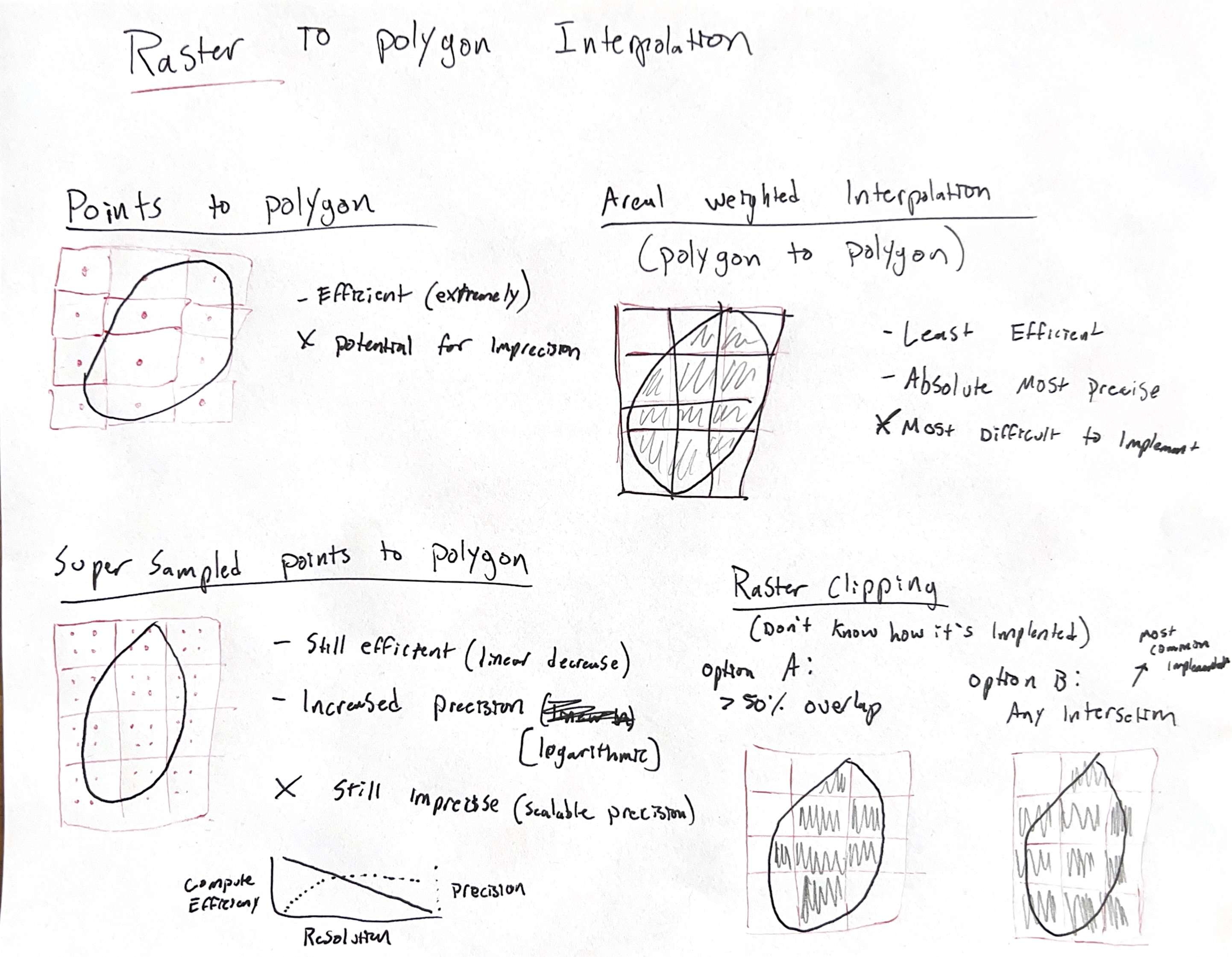
Spark Raster Pipeline (CONUSDB)
As we had been migrating an increasing amount of our data to Spark on Databricks, we needed a way to efficiently process and analyze raster data at scale. I built a large pipeline in Spark that allowed us to ingest, process and analyze raster data across the continental United States. We explored a number of raster interpolation and storage methods, ultimately implementing our own solutions before the maturity of raster solutions in Apache Sedona or Databrick Mosaic. An interesting memo I came across while developing this:"A Pixel is Not a Square"
Parcel Ownership Reconciliation
Working with continental scale parcel data was a neccessity for some of the types of analyses we wanted to perform. Crucially, we needed to know the full land holdings of an individual entity across the United States. We had around 150 million individual property records and we wanted to be able for any individual owner to query every property under their ownership. To achieve this, I used a variety of natural language processing techniques and a network simplification method to build a CONUS-wide dataset of all properties owned by a single entity.
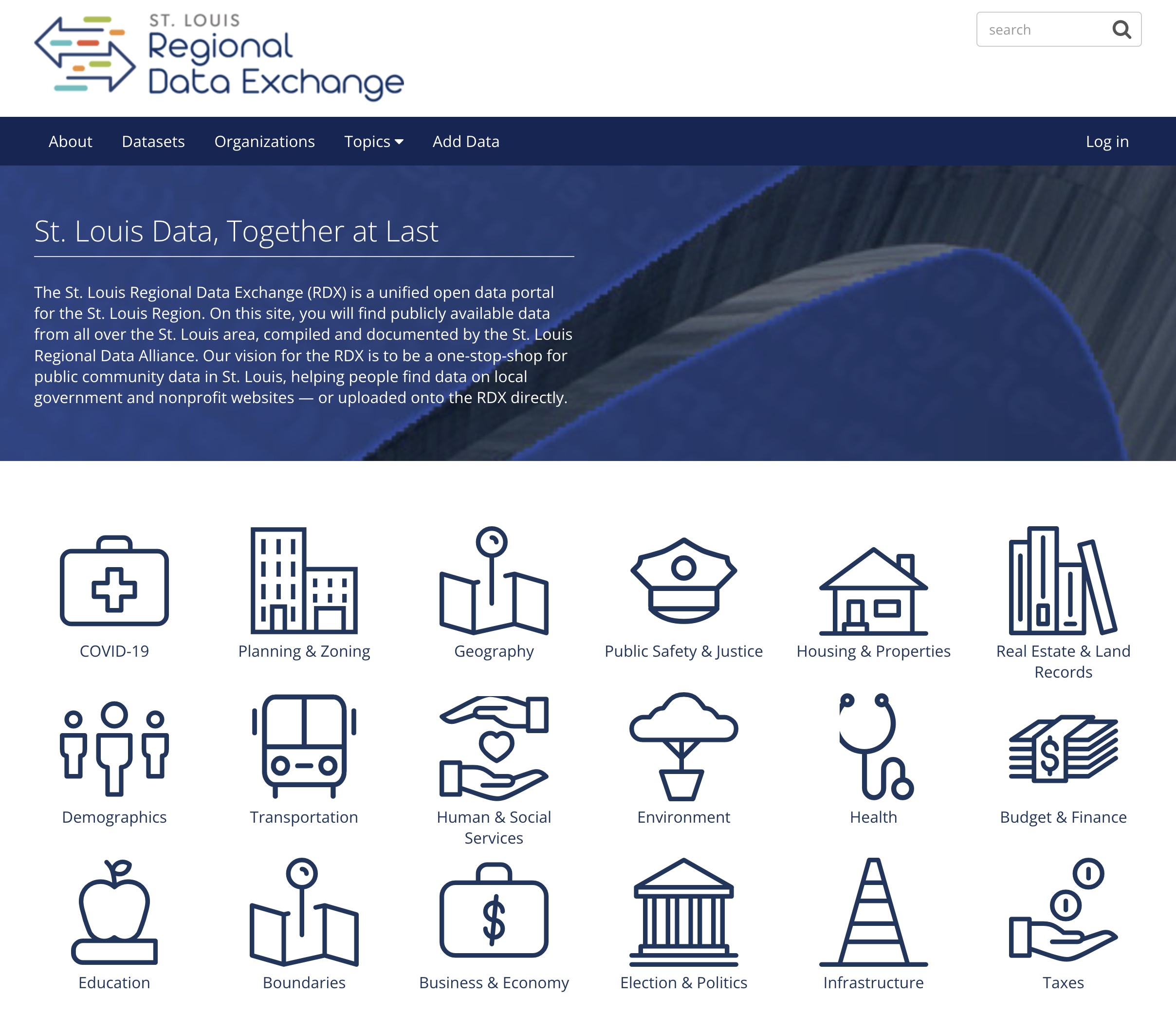
St. Louis Regional Data Alliance
Regional Data Exchange
The core mission of the RDA was to put data in the hands of stakeholders spanning from highly-technical academics and agencies to less-technical members of the public. In addition to the APIs that we released, we built an openly accessible portal that catalogs all known regional datasets.
Available at rdx.stldata.org
Open Data Commons
Data is powerful, but only in the hands of the right people. APIs are a powerful way for programmers to access data in an organized way, but for less technically proficient consumers, a REST API may be a barrier to data access. Recognizing this, we set out to develop the data commons. Just as Swagger and ReDoc have made the process of documenting REST APIs trivial, the Data Commons aims to deliver data in an easily consumable format (CSV) and also offer quick visualization of queried data.
Developed with Nico Stranquist, demo available here

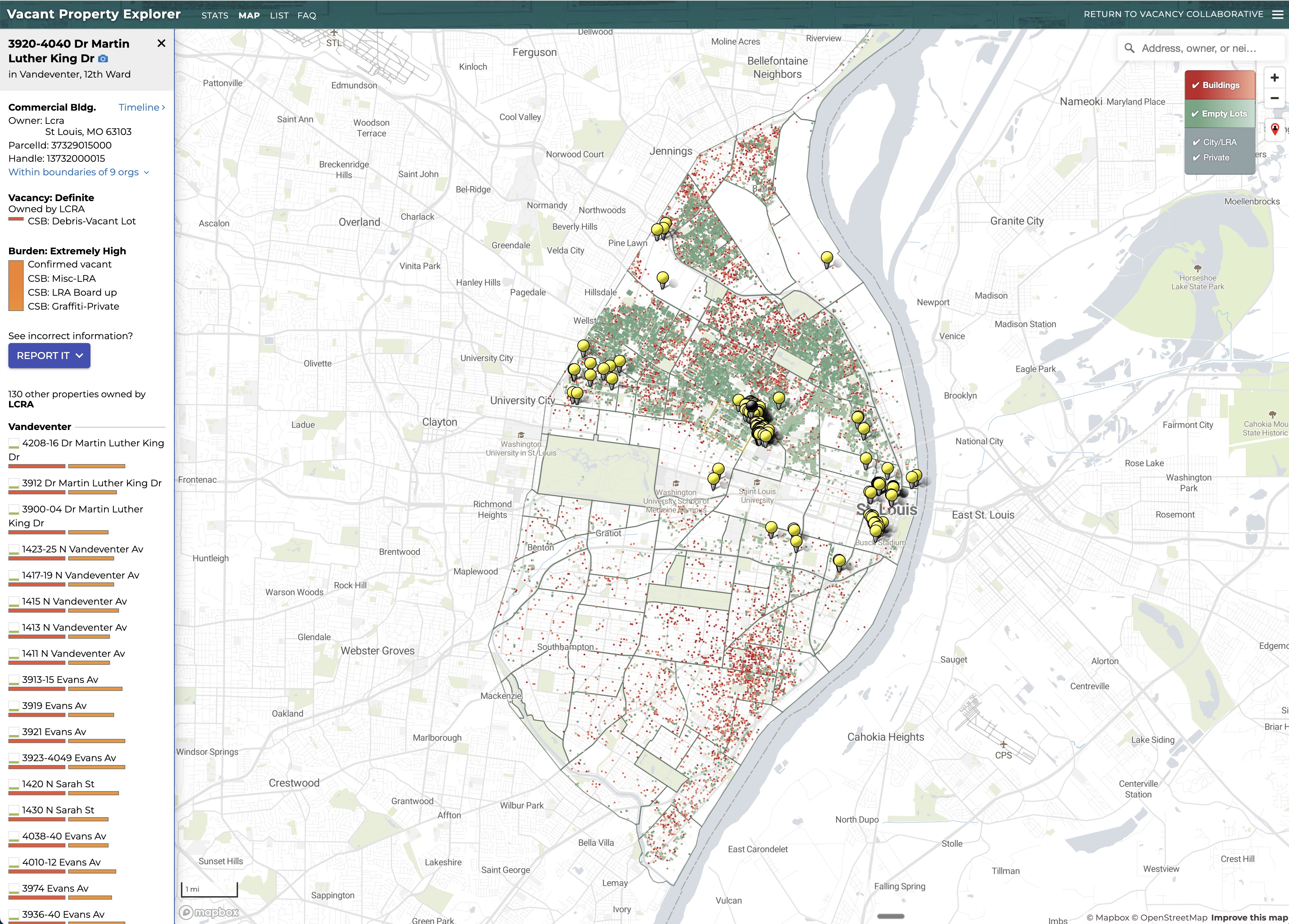
St. Louis Vacancy Portal
The St. Louis Vacancy Portal was the ultimate culimination of years in developing a classification method and data streams to be able to produce routinely updated estimates of property vacancy and provide legal officials the resources neccessary to pursue abatement.
I built and maintain a scraper to ingest streams of property data from the City of St. Louis that feed into a custom web application developed by Dave Menninger
Actively Maintained: www.stlvacancytools.com
An Open Stack for Open Data
One challenge we encountered at the Regional Data Alliance was developing in the open with a low barrier to entry. We had a number of volunteers and external contributors who would often work short or unpredictable periods. At the Regional Data Alliance we developed in the open, including infrastructure, and wanted a repeatable technology pattern to work across projects and repositories. I presented our technical stack at a local technical meetup, and used this an as opportunity to recruit new contributors.
See the presentation here: An Open Stack for Open Data
Standard Parcel Data (REDB)
One of the first projects developed through the Regional Data Alliance was the so called "regional-entity database" or REDB. Lead initially by Johnathan Leek, I played a significant role in launching the first openly available dataset of standardized parcel data in the region.
We used this to generate our first estimates of vacancy, but later replaced it a solution built in collaboration with internal stakeholders at the City of St. Louis.
During the course of this project, I participated in an AI Accelerator program sponsored by DataKind and Microsoft.
Unmaintained: REDB Github

Washington University School of Medicine in St. Louis
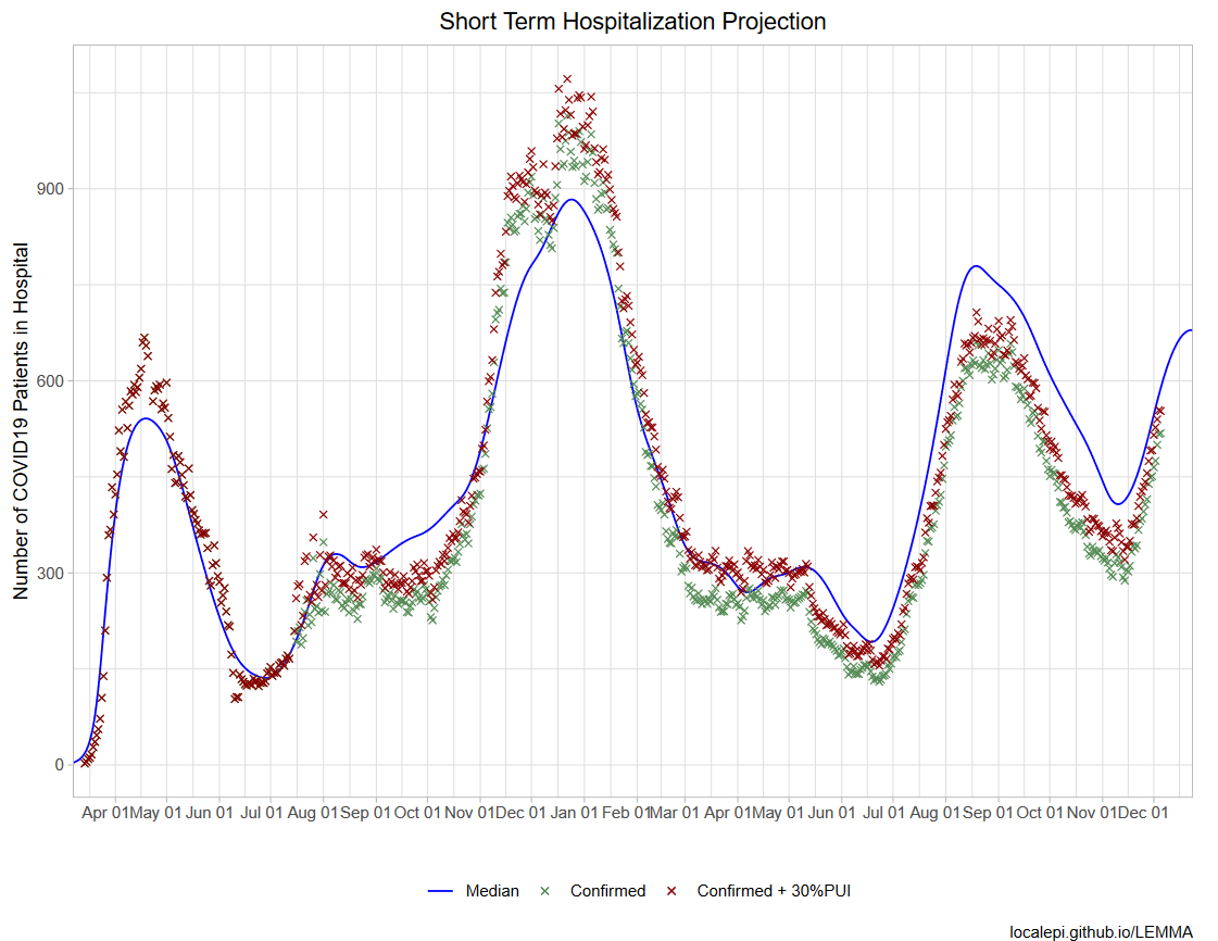
Projecting COVID-19 hospitalizations
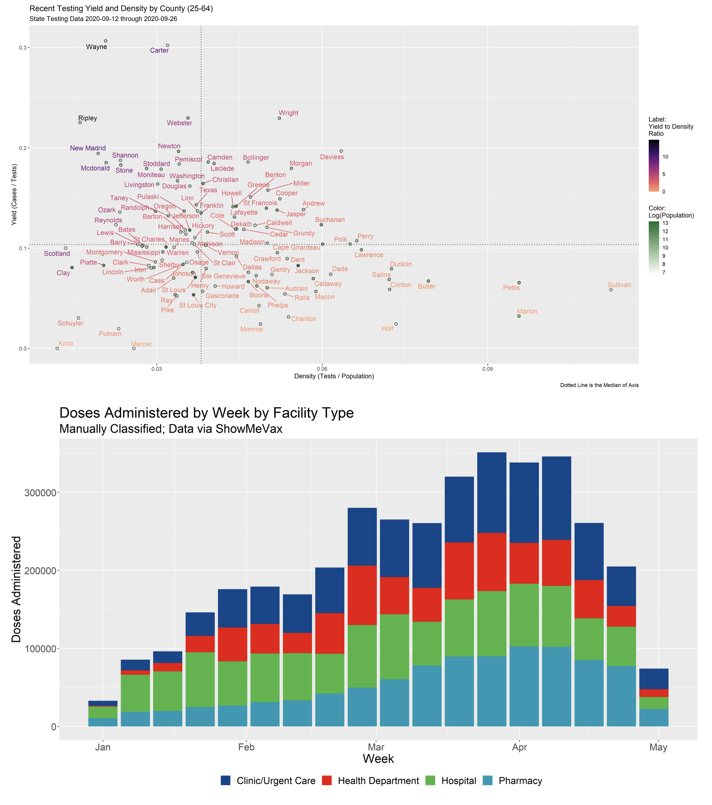
Perhaps the most important metric during the COVID-19 pandemic was frequency of hospitalization and total hospital utitlization. Measuring confirmed cases through tests alone is extremely prone to under-ascertainment. Hospitalizations, however, are nearly unavoidable and offer direct insight into the true severity of COVID-19 transmission. Hospital utilization also signals the most risk of mortality, both in the progression of COVID-19 infections and the capacity for healthcare systems to address other critical forms of medical treatment.
Developed with Joshua Schwab and numerous collaborators, I maintained a fork of the "LEMMA" model for the state of Missouri.
The model was updated weekly with inputs from all health systems across the state, aggregated by our partners at the Missouri Hospital Association, and used both to project future hospitalizations and simulate the effect of various public health interventions.
Model results were shared prominently with stakeholders across the state, including the Governor's office, the Missouri Hospital Association, the St. Louis Covid Task Force, local health agencies and the largest healthcare providers in the state, among others.
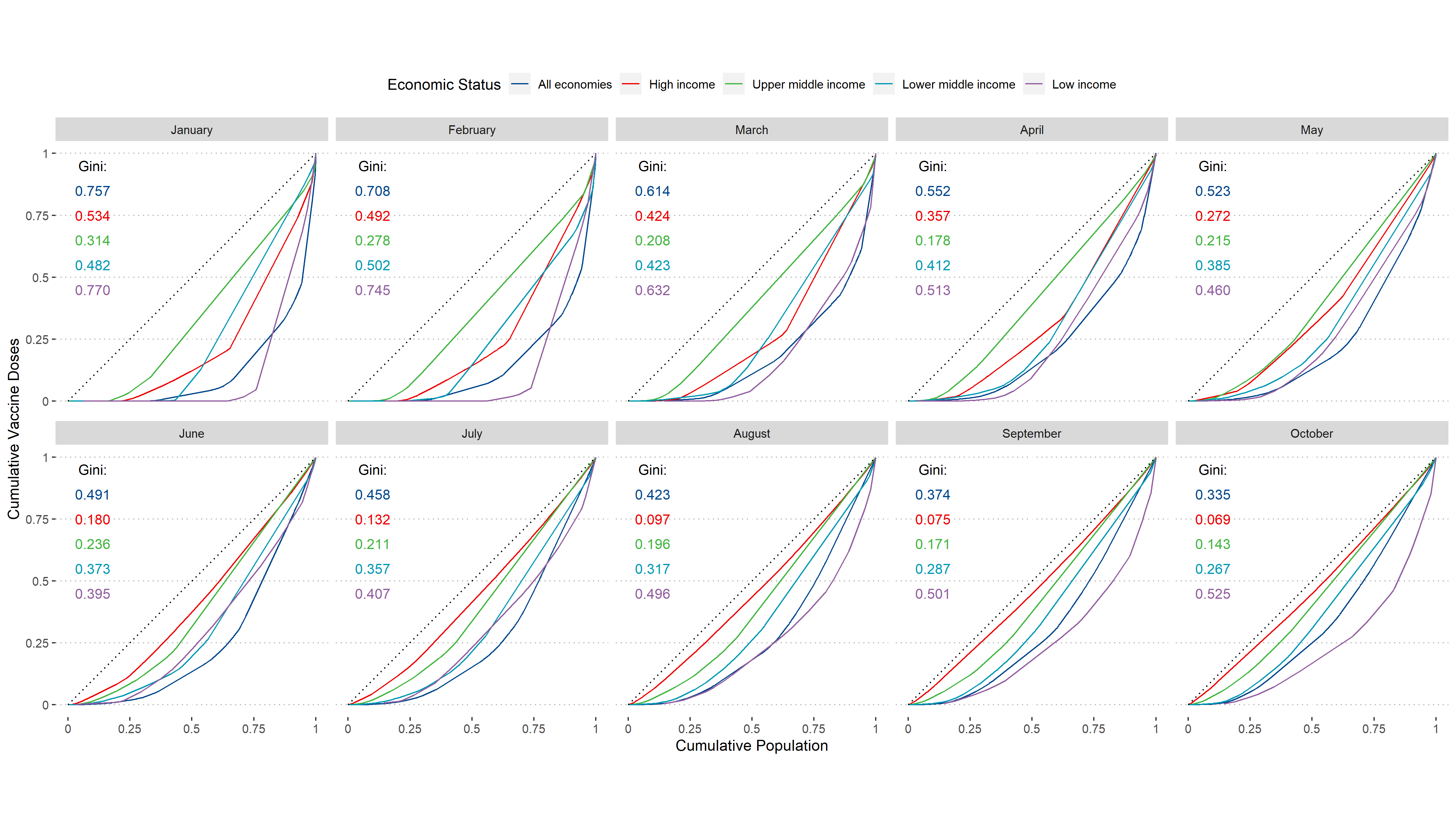
Statistical Measures of Equality
During COVID, there were many questions about an equitable distribution of vaccines and an inequitable distribution of cases and morbidity related to COVID infections. This motivated an inquiry into statistical measures of inequality and their interpretation for use in public health. I investigated a number of popular indices and even developed some novel methods of my own.
Demo Here and R Package Index Here
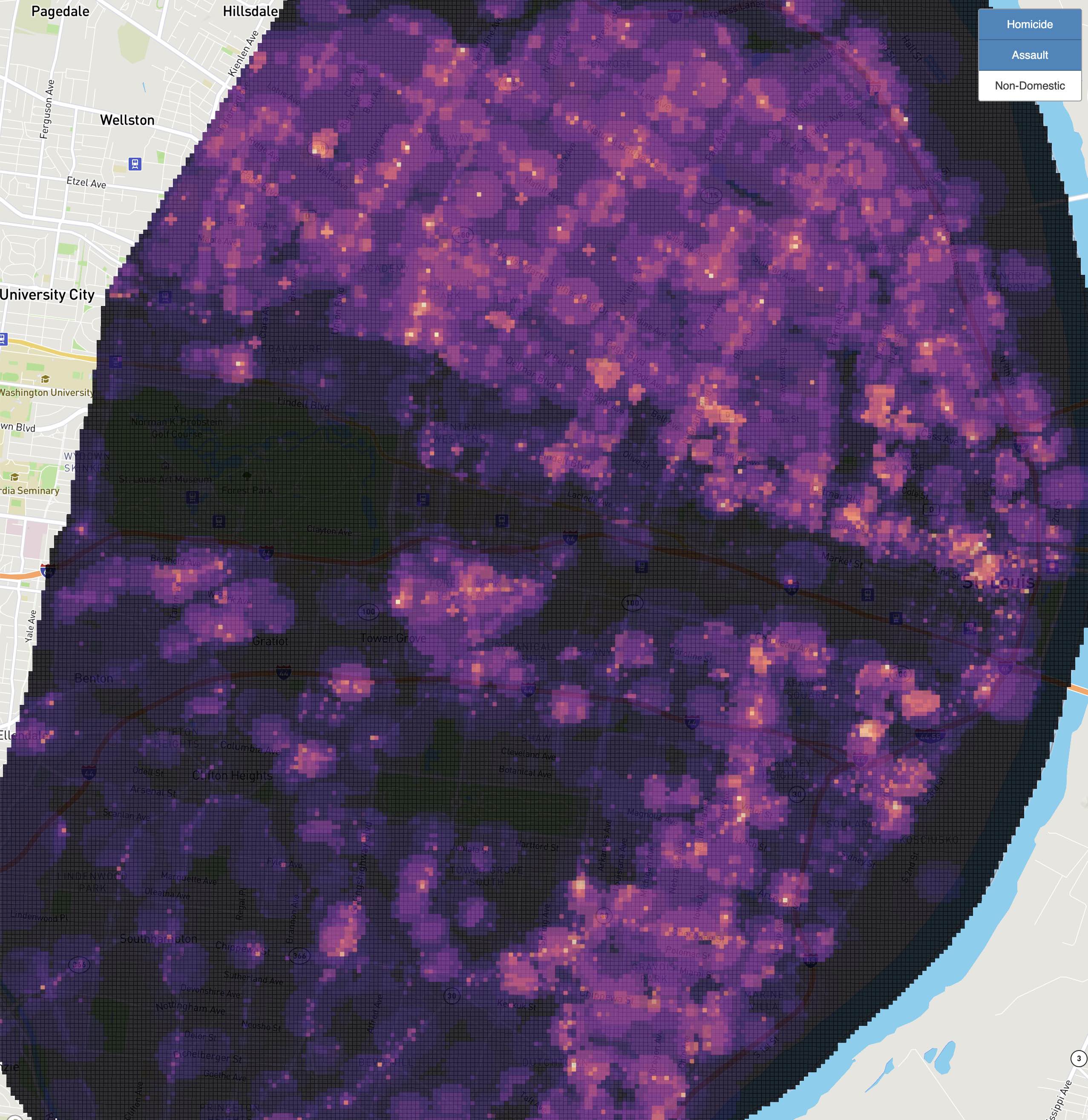
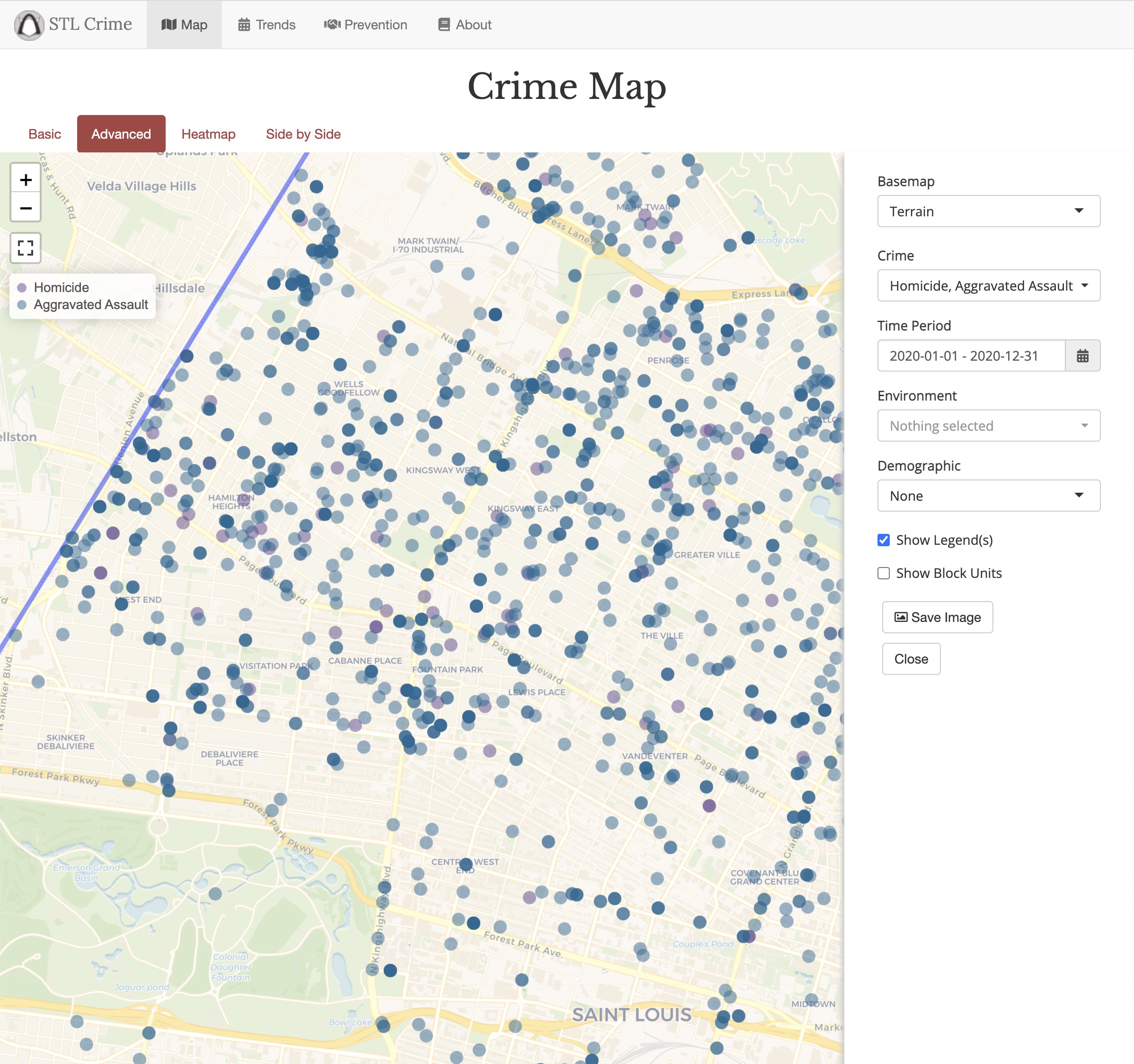
Spatial Correlates of Violent Crime
At the intersection of my research interests in violent crime and vacancy, I conducted an analysis using Risk Terrain Modeling to observe the relationship of vacant property on violent crime (homicide and aggravated assault).
We found vacancy to be among the most prodominant drivers of violent crime, and observed varying geographic effects of risk terrain modeling in constrained local models.
Demo Available and Publication Here.
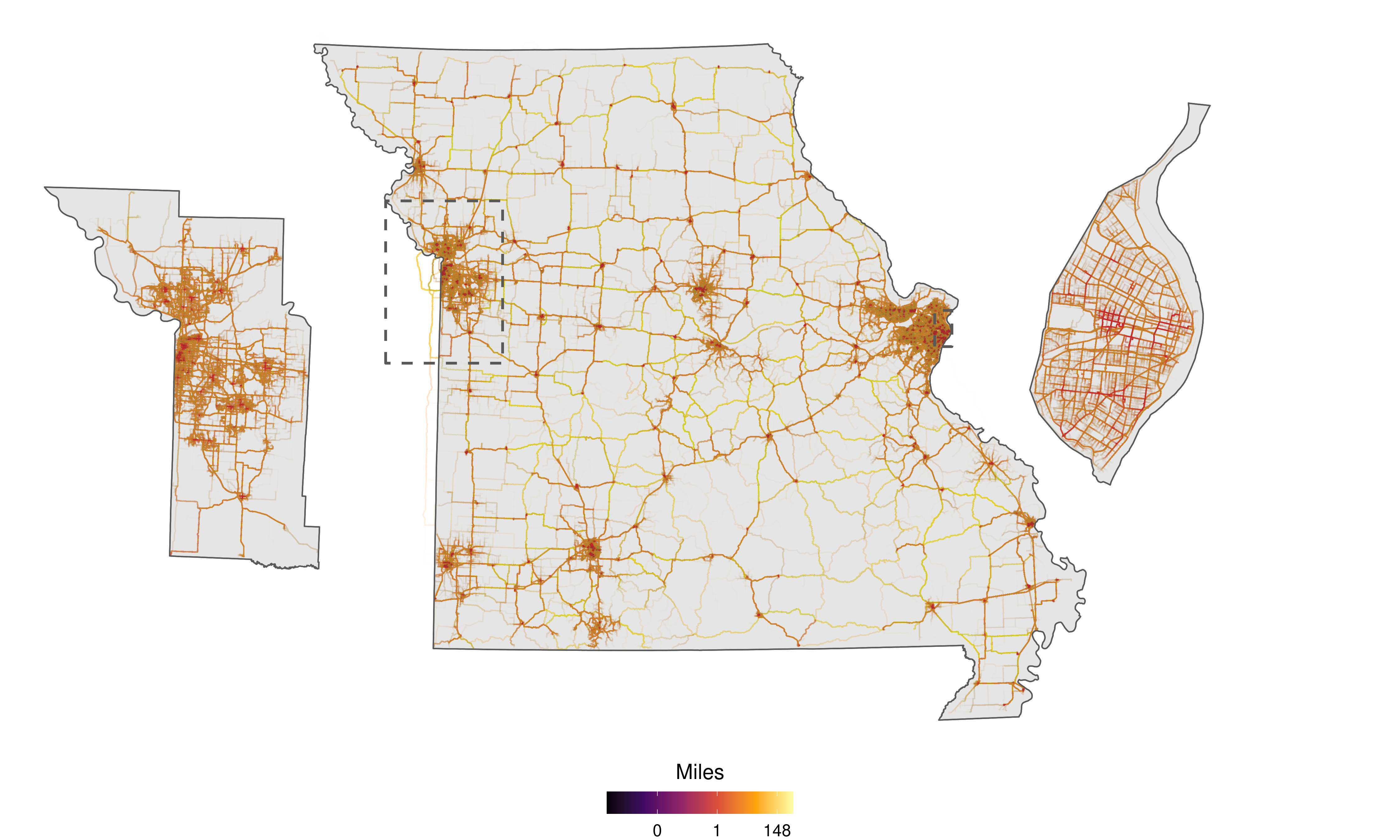
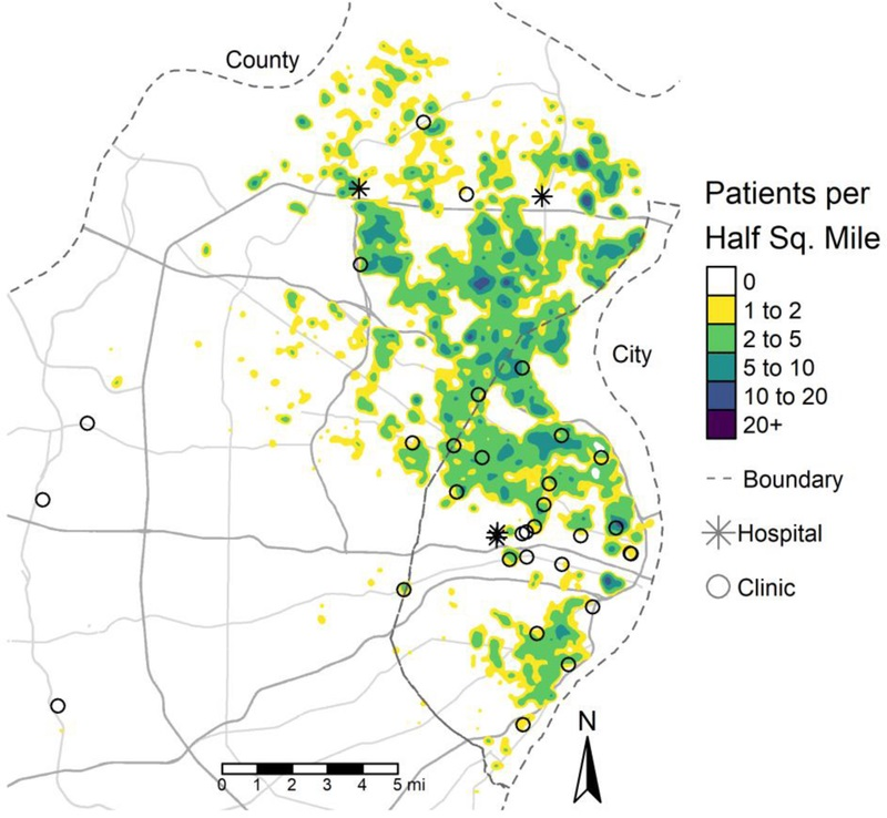
Private Geospatial Infrastructure
Most of my research at the time used highly-sensitive patient records. In addition to implementing best practices for data security, I built a variety of private geospatial infrastructure. This included a custom built geocoder and road network routing solution to compute a variety of spatial metrics used in research with collaborators.
I originally developed both my own road-interpolation geocoder and weighted road networking graph simulator and later switched to more scalable open source solutions including Pelias and Graphhopper
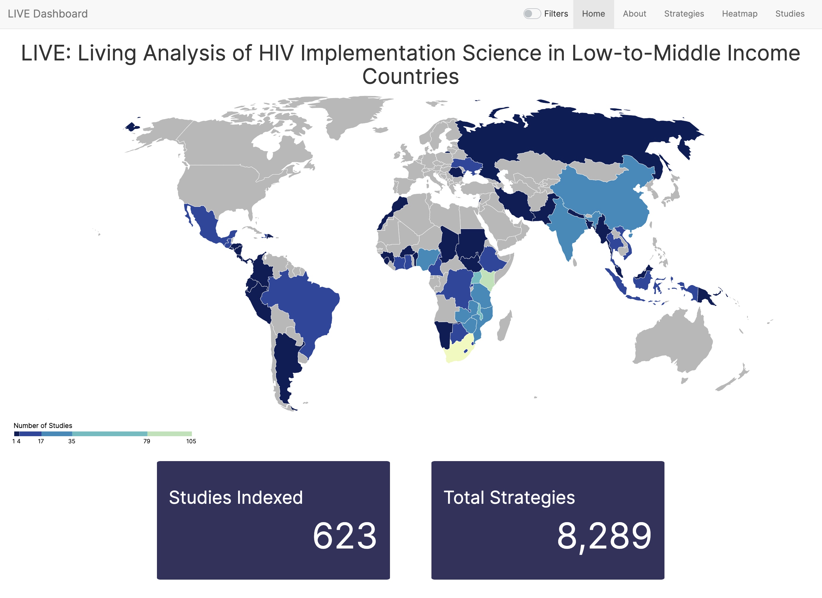
LIVE Dashboard
A large research team compiled hundreds of implementation methods papers for addressing HIV in low and middle income countries. We wanted to disseminate this reserach in a highly interactive manner and I was tasked with building an app to make this happen.
The result is a highly interactive shiny dashboard that has been viewed by hundreds of researchers.
Actively Maintained:live.bransonf.com
Publication: JIAS
Saint Louis University
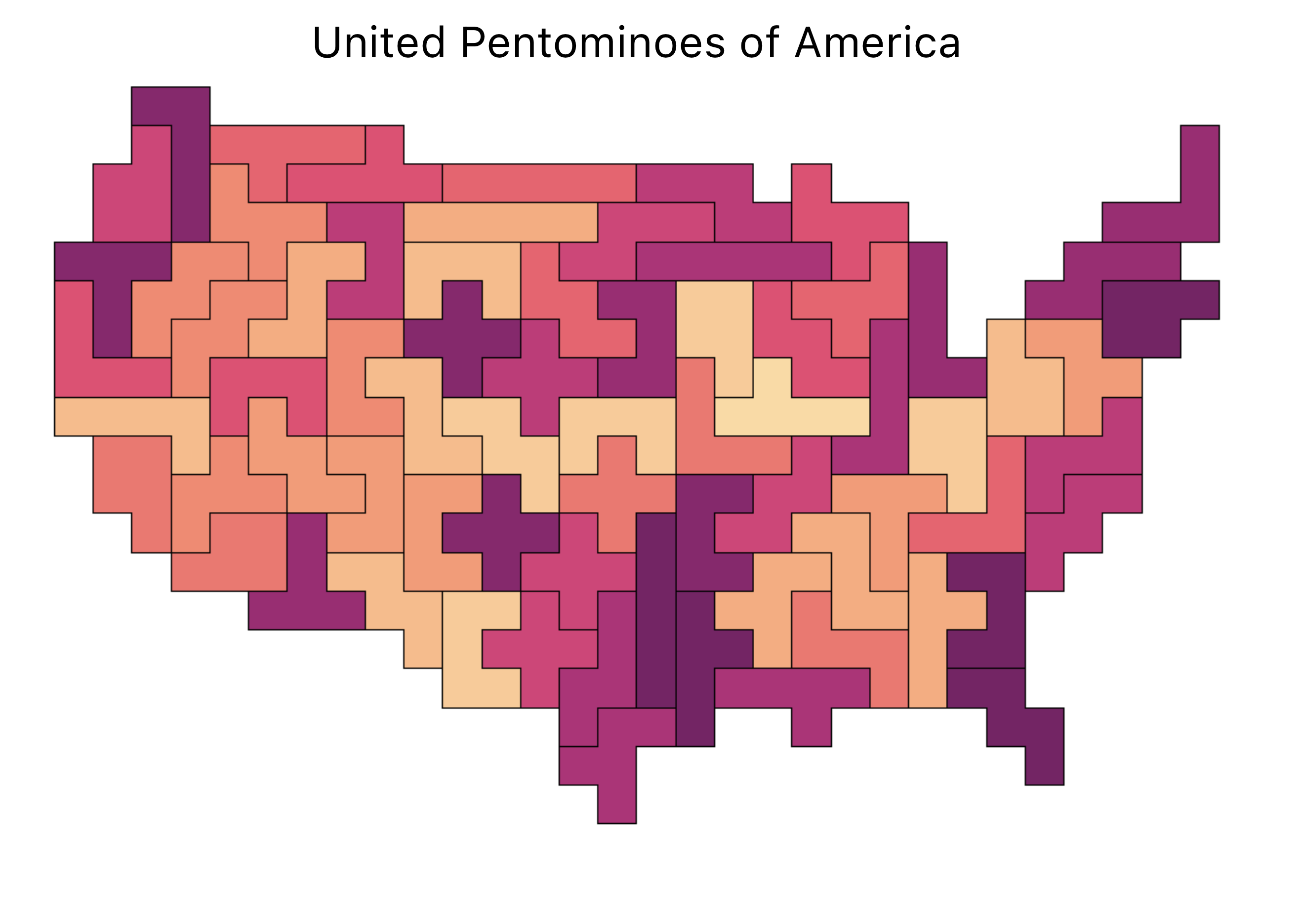
Testing sensitivity to MAUP with Polyominoes
In unfinished work, I begin to develop a sensitivity analysis to the Modifiable Areal Units Problem (MAUP) using Polyominoes.
This unconvential approach to producing a randomized sampling kernel using Polyominoes offered a robust stochastic method both for the measurement of MAUP sensitivity as well as the re-allocation of aggregate spatial data for further analysis. It's main shortcoming, however, was the massive ammounts of compute required to scale the kernel size over larger or higher resolution geographic data.
Made Possible by Matt Busche's Polycube program
You can also see some of my experiments with Polyomino-packing on this now-archived homepage of my website.
Patterns of Civic Engagement
Part of my research as an undegraduate involved exploring new sources of data for analyzing and understanding cities. This included 311 data, or requests for non-emergency city services. In the City of St. Louis, this is known as the Citizen's Service Bureau, or CSB.
One inquiry that I had about these data was how representative they are of localized civic engagement. The hypothesis was that areas of low voter participation would also have a low utilization rate of the CSB.
The results were remarkably well aligned with my hypothesis, showing a high correlation of voter participation with CSB utilization, and the effect size was greater in local elections compared to the presidential election.
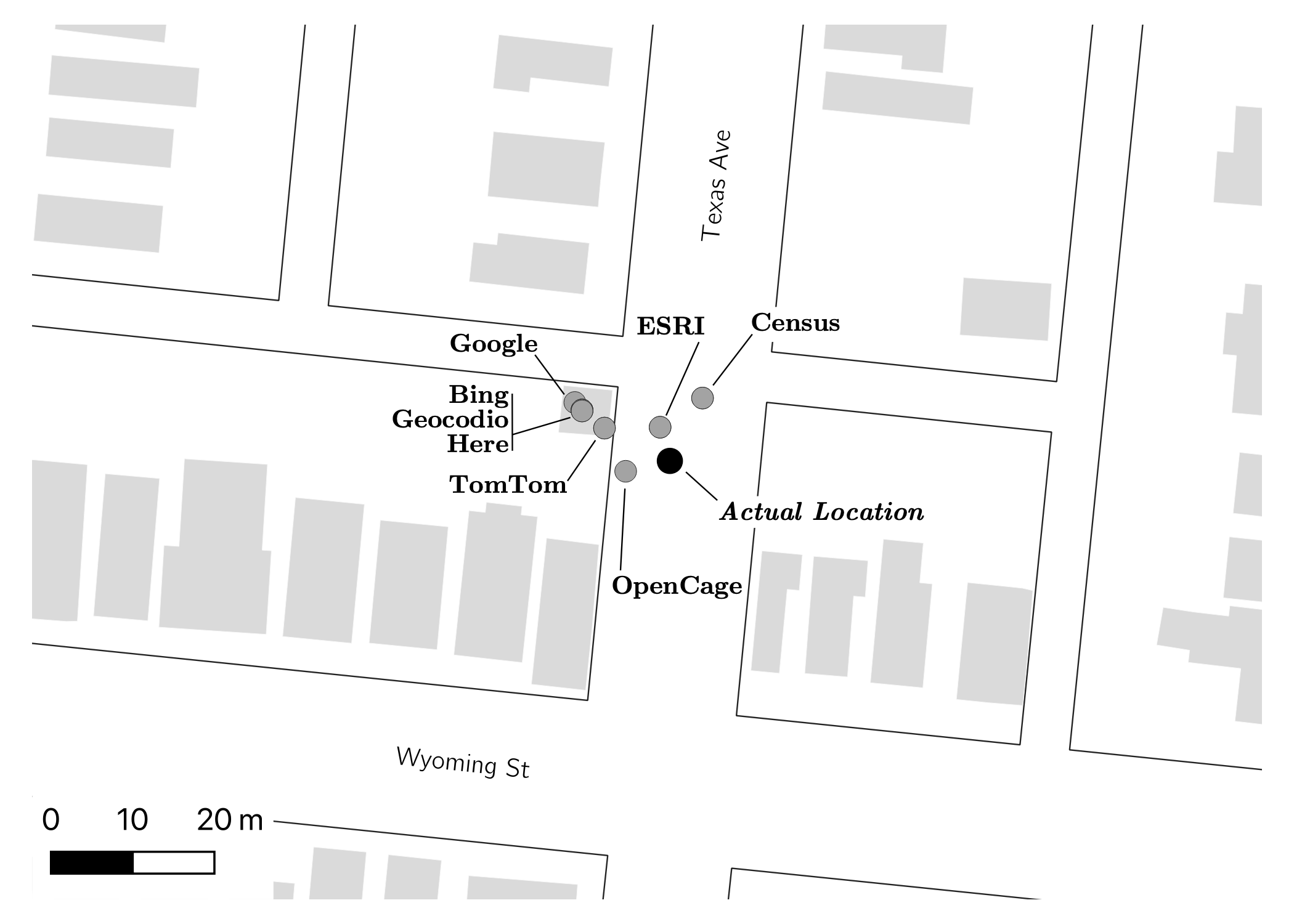
Building an Open Source Geocoder
Geocoding, the act of converting an address string into a numeric location, was a central part of my education in GIS and a recurrent neccessity in my research. After having dealt with a number of nuanced datasets that required specific preprocessing to achieve desriable geocodes, Chris Prener and I decided to build our own.
We built our own geocoder in R and compared it with a number of commercial geocoding options available at the time, including several free sources, and published our findings in Trasactions in GIS.
areal R package
The Modifiable Areal Units Problem (MAUP) was a key component of my studies and research in GIS.
With the areal R package, Chris Prener and I attempt to implement a variety of methods for areal weighted interpolation using the spatial features (SF) framework in place of the older SP framework for spatial data in R.
Dasymetric, Pycnophylactic, Regression and Hybrid methods were implemented for both spatially intensive and extensive data types.
Currently Maintained by Chris Prener: areal Github

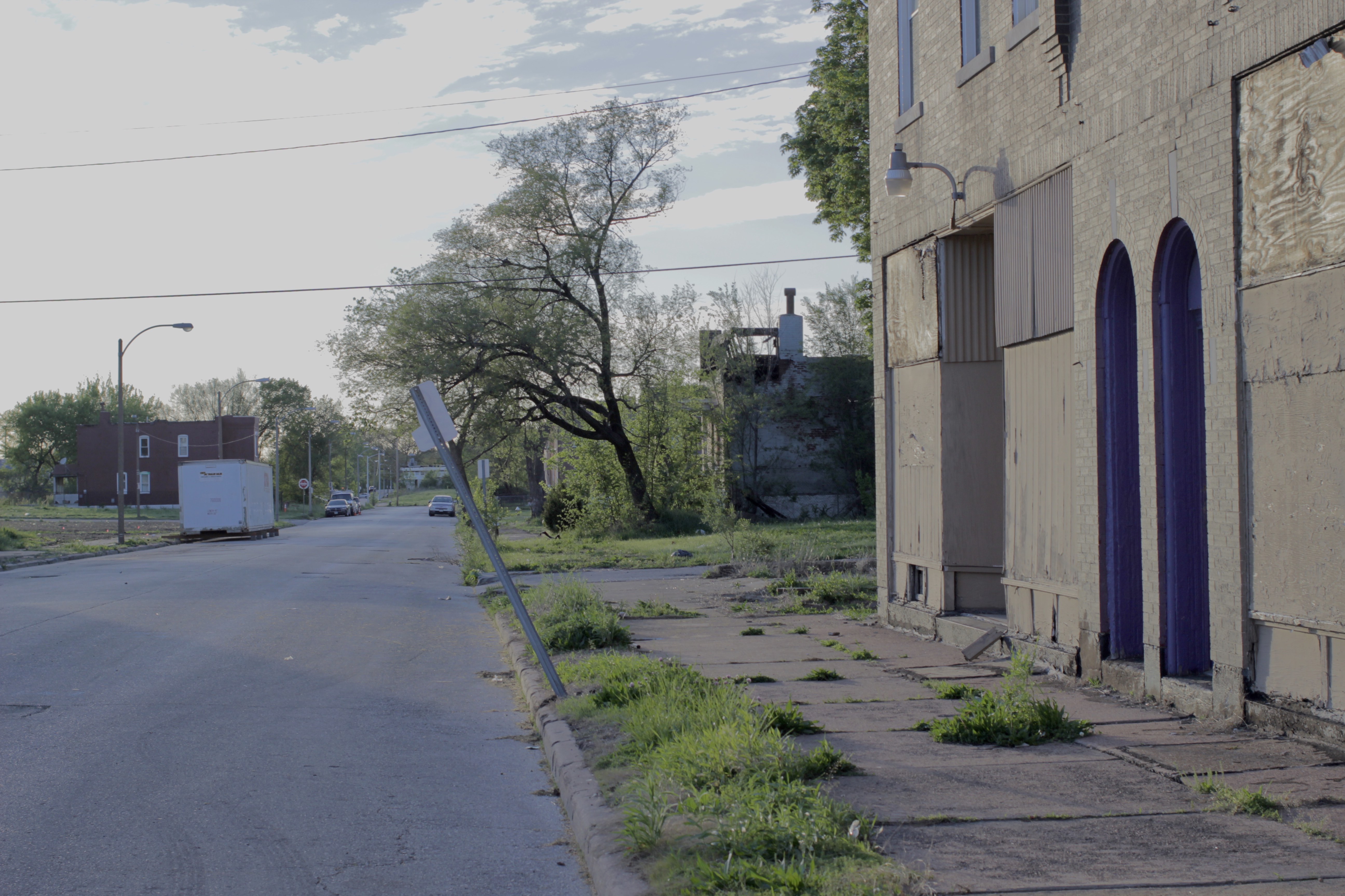
Creating a Definition of Vacancy
St. Louis, Missouri has experienced one of the most salient urban declines in the country, resulting in a rise of property vacancy. It was long suspected this was pivotal in a variety of worsened outcomes, but a clear definition of vacancy and the corresponding number and location of vacant properties was unknown. I played a foundational role in building the defintion, data infrastructure and dissemination of the number and locations of vacant properties in St. Louis.
I became heavily involved in the St. Louis Vacancy Collaborative including the creation and implementation of the Vacant Property Methodology.